My first post featured Dutch artist Piet Mondrian whose oeuvre of grid-like paintings with squares and rectangles of primary colours has inspired a plethora of Mondrian objects from architecture to clothing.

Composition II in Red, Blue, and Yellow (1930)
It seems like the world just can’t get enough Mondrian.
Without intentionally seeking him out (okay maybe a little bit), I came across Mondrian in my recent travels to Ottawa and New York and figured I would write a follow-up post in lieu of these discoveries.
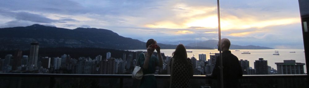
I’m not sure if the idea of coloured window blocks in architecture derives from Mondrian, but seeing multiple buildings in both cities with this feature certainly made me think of him.

Coloured Windows in New York

Coloured Windows in Ottawa
During my travels, I paid a visit to my Alma Mater. A lot of construction was started there as I was finishing my degree, and I wanted to see the completion of these new buildings. Not only did I see finished projects, I also saw buildings erected that I didn’t even know were part of the plan. The building above is a new residence standing in what was one of the precious few green spaces left on a campus that everyone used to adore for its green spaces. Can you tell I’m a bit nostalgic about “the good old days” when I attended Carleton?
These other Ottawa buildings also have Mondrianesque qualities to them:

 In New York, I went to the Museum of Modern Art on their free “Target Fridays” – a time frame that I would recommend avoiding because of the massive crowds. It actually felt more rushed and crammed than the streets, partly because I only had an hour before closing and so was racing from painting to painting to absorb as much as I could – not the ideal pace to appreciate art.
But it was still worth it, particularly to awe at Monet’s water lilies and to contemplate this painting by Piet Mondrian that he made as an ode to the Big Apple.


Click on the right picture for an enlarged version of the painting’s fascinating description.
Looking back at the painting on the left, can you picture the city grid with the yellow lines as streets, the blue and red squares as nodes of people and activities, and the occasional grey thrown in as moments of pause or respite from the daily grind? Other New York images this painting evokes for me are traffic lights, the omnipresent yellow of taxis, the neon lights of Times Square, and the colourful lines on the subway map.


 Even though the painting doesn’t literally speak, I look at it and hear the noise of the city. It’s loud. Cars are honking. People are getting in and out of taxicabs. Vendors are trying to make a sale. Strangers are getting impatient while waiting in line for their morning Starbucks. Considering that jazz music inspired this painting called “Broadway Boogie Woogie,” Mondrian’s title invites us to “hear” his painting – to mix one sense impression with another sense in what’s called synesthesia.

Composition in White, Black, and Red (1936)
Whereas the dynamic spaces in his previous compositions (such as the one that was on display beside it, which is pictured above) appear at the edges, the dynamic spaces in “Broadway Boogie Woogie” emerge at the intersections – where people, buildings, streets and conversations collide in a syncopation of lights as colourful as the city itself.


Pingback: Have Gun will Travel « ecollage
Pingback: Frozen Music, Frozen Space | textingthecity